Froosh, the Nordic pure fruit smoothie brand, was fading fast. Across its core markets of Denmark, Finland and Sweden, volume was in either decline or growth was sluggish. The problem lay with the unappetising and unappealing brand identity. It had zero shelf standout and failed to communicate the fruit-only message.
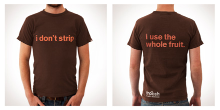
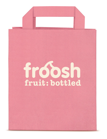
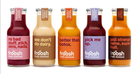
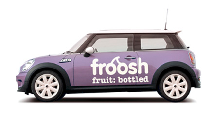
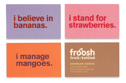
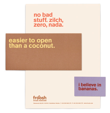
Called in to carry out a major brand refresh, Pearlfisher created a new logo that is timeless and confident, with a bright, tasty and natural colour palette. The new strapline, “fruit: bottled”, communicates the fruit-only message in a simple, no-nonsense way.
In May 2010, the new Froosh brand identity began hitting the shelves in Sweden, Denmark and Finland. From third on the podium, it’s now the number one smoothie brand in the Nordics with 107% increase in total volume sales between January and May 2011 (compared to same period pre-launch). Following the relaunch, Froosh enjoyed a wave of new listings and retail customers frequently cited the new identity as a significant factor in their purchasing decision.
The DBA Design Effectiveness Awards recognise the return on investment that a coherent, well-thought-out and professionally executed design strategy can achieve.
THE COUNTDOWN