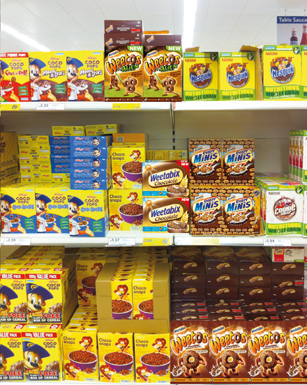

Weetabix were looking to extend the appeal of their brand by launching a chocolatey product for kids. This is always a difficult task in the cereals market, but Weetabix needed to be sure that this new addition wouldn’t affect the original Weetabix market share, or depreciate the brand’s long-established ‘wholesome goodness’ message.
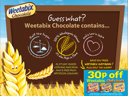
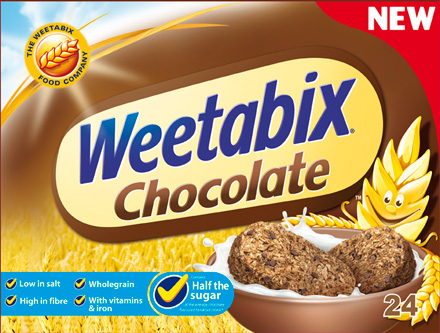
Springetts’ solution focused on happiness. Happy breakfasts for happy families. In packaging terms this required a balance between goodness and the chocolatey taste. They carefully depicted the product to provide appetite appeal, offering reassurance to mothers through its familiar appearance. The ‘wheat sheaf’ character provided an emotional connection, promising goodness while signalling that the product was for children. All nutritional details were communicated in a friendly and fun way on the back of the pack.
In the first year since launch, Weetabix Chocolate has been ahead of target with above average trial and repeat purchase rates. The product has experienced a 40% consumption with kids aged 0-16, and parents aged 36-44 have also proved to be important customers, indicating clear success in balancing product messaging and appeal.
The DBA Design Effectiveness Awards recognise the return on investment that a coherent, well-thought-out and professionally executed design strategy can achieve.
THE COUNTDOWN