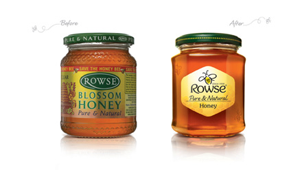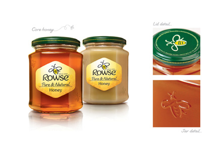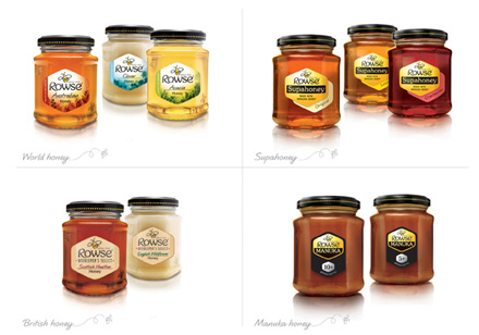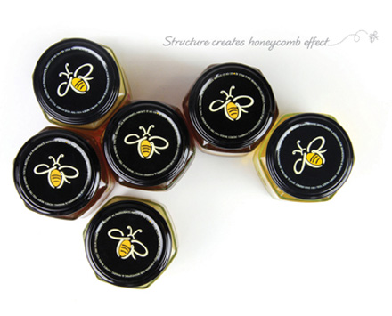


Despite being a £37m brand and having strong shelf presence, very few customers recognised the Rowse honey brand. Rowse needed to create an iconic identity that would achieve brand leadership and drive customer awareness. They also needed a clear brand architecture to enable shoppers to navigate the range, and to create a strong structure for future product development.
BrandOpus were asked to redesign the identity and packaging to link the consumer’s love of honey with Rowse. Staying within the visual realms associated with honey, BrandOpus picked up generic elements and developed them to be owned to Rowse. Simple measures, such as softening the hexagonal shape and personalising the bee with the initials of Tony Rowse, were subtle but very effective.
The work by BrandOpus allowed an increased price point of 17%, while retaining customers. The design also allowed NPD launches with a value of £1.7m retail sales. There was an increase of 11% in distribution in major accounts, and consumers found the product 6.4 seconds more quickly on shelf. Overall, consumer awareness increased by 28%, with 46% of consumers recognising and recalling Rowse honey.
The DBA Design Effectiveness Awards recognise the return on investment that a coherent, well-thought-out and professionally executed design strategy can achieve.
THE COUNTDOWN


